Helping Hand
Therapy
Brand Identity / Web Design — 2025
Client
Helping Hand Therapy
Year
2025
Services
- Brand Identity
- Web Design
- UX / Information Architecture
- Collateral Design
Role
Web & Brand Designer
2 months
Result
Complete system, launched
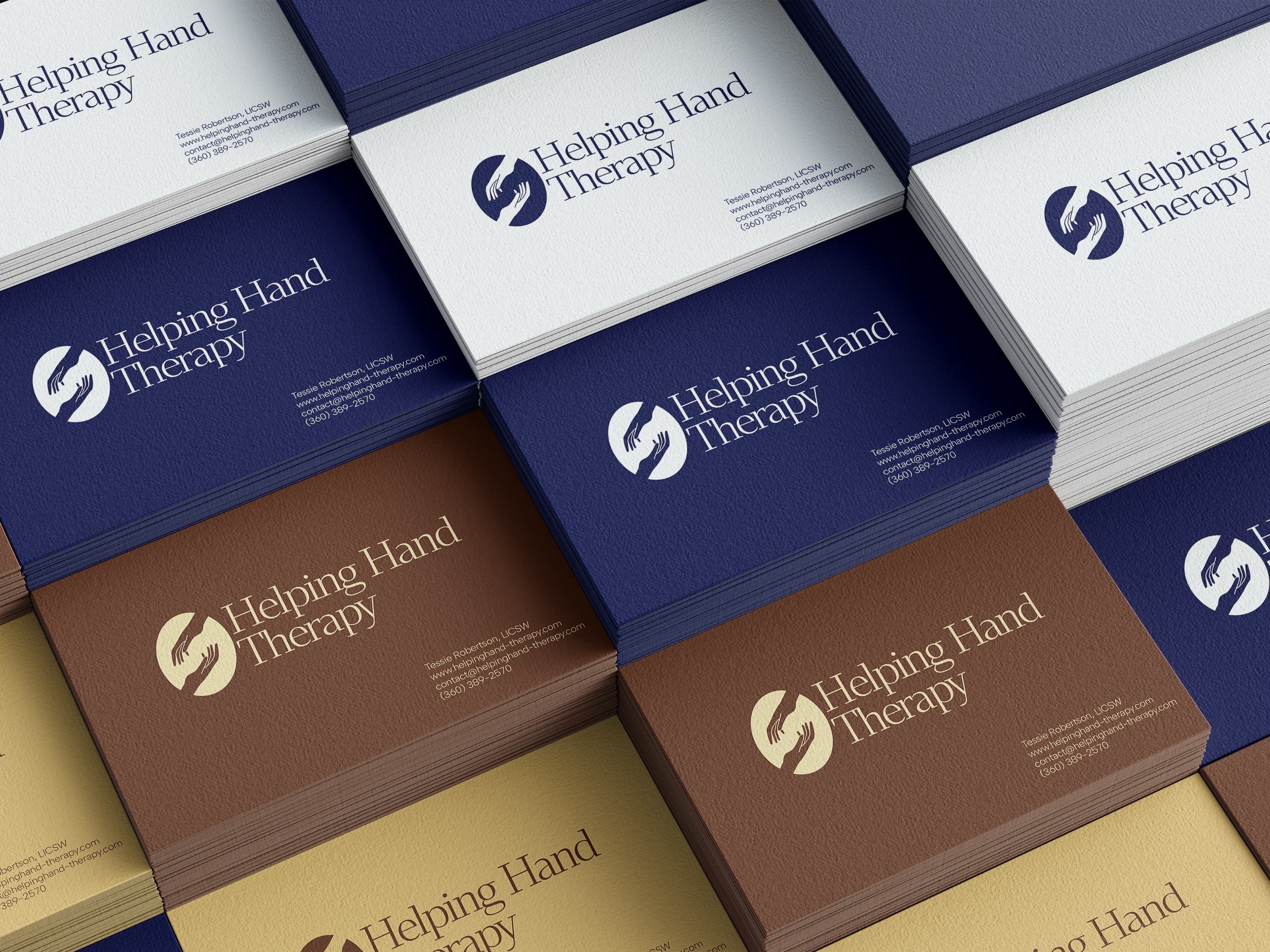
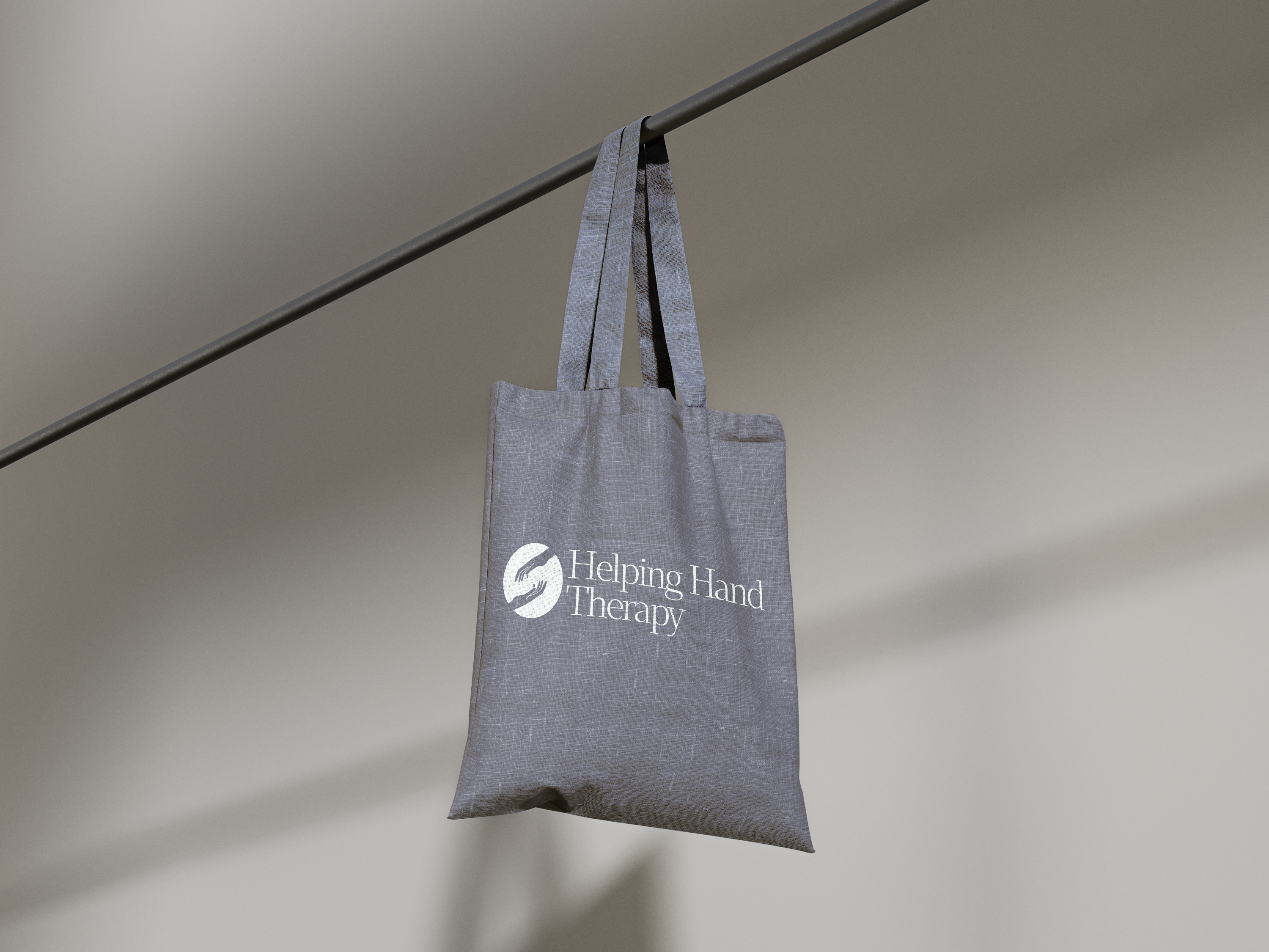
Brand + web + print · Differentiated from day one
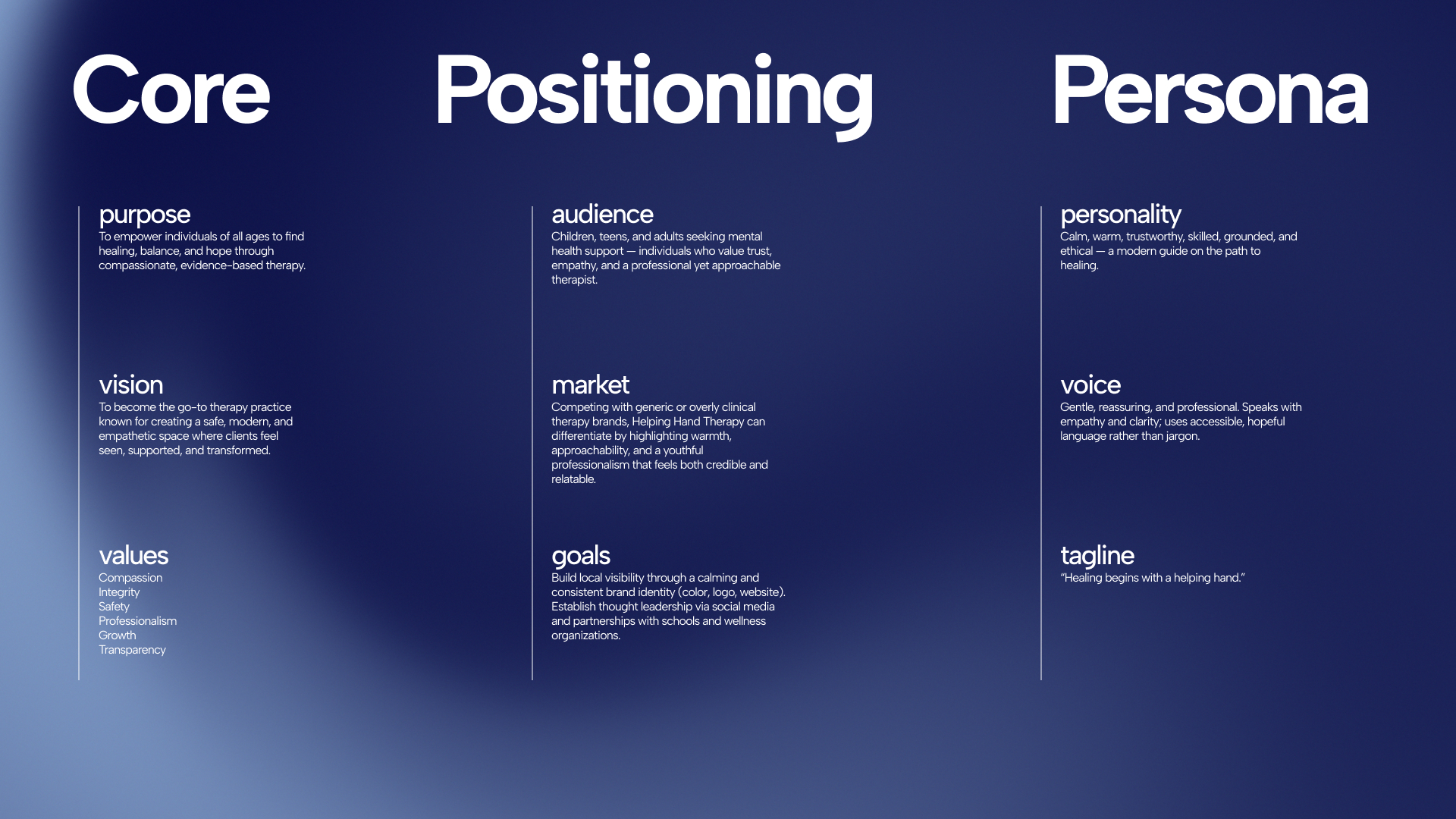
A cohesive brand identity and website for a modern therapy practice — built to strengthen trust, communicate professionalism, and make accessing mental health support feel simple, grounded, and human.
The wellness space is saturated with near-identical visual identities — muted sage palettes, stock photography, generic templates. Helping Hand needed a clear point of view without sacrificing accessibility or inclusivity. The visual system had to feel empathetic and credible at once: neither overly soft nor coldly corporate.
Equally critical was the digital experience. Therapy offerings can feel abstract and overwhelming to someone arriving already stressed or uncertain. The site needed to reduce friction at every step — clear service pathways, predictable navigation, and an interface that felt grounding across any device.
Calm by design
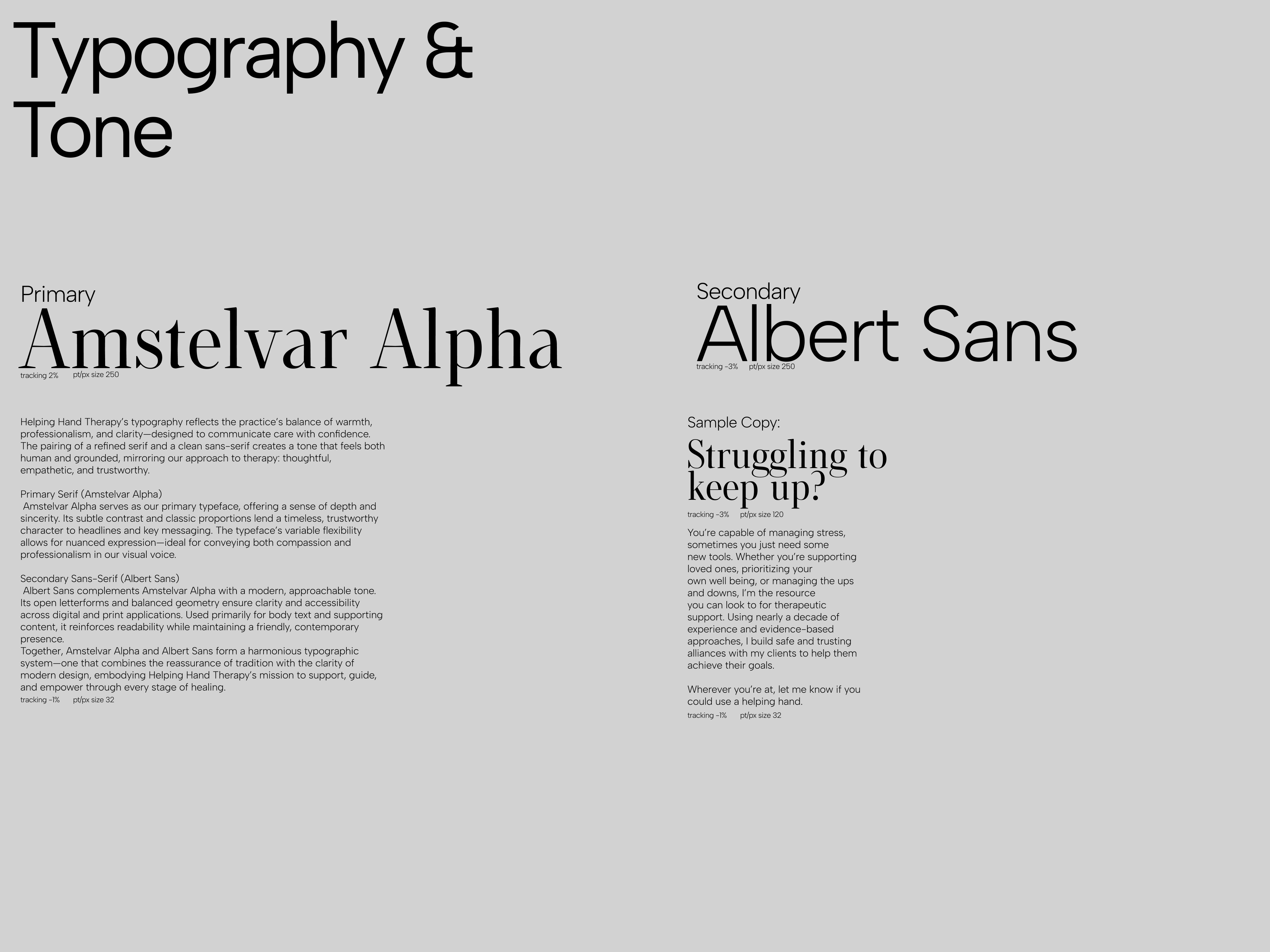
The brand system started with tone: the goal was confidence without distance. A typographic pairing of a humanist serif and a clean sans-serif communicates both care and competence — warm enough to feel human, structured enough to signal expertise.
On the web side, the focus was information architecture. Therapy offerings were reorganized around how people actually search for help — by what they're experiencing, not by clinical category. Navigation was stripped back, service pages were restructured for clarity, and every path was designed to end at a clear, low-friction next step.
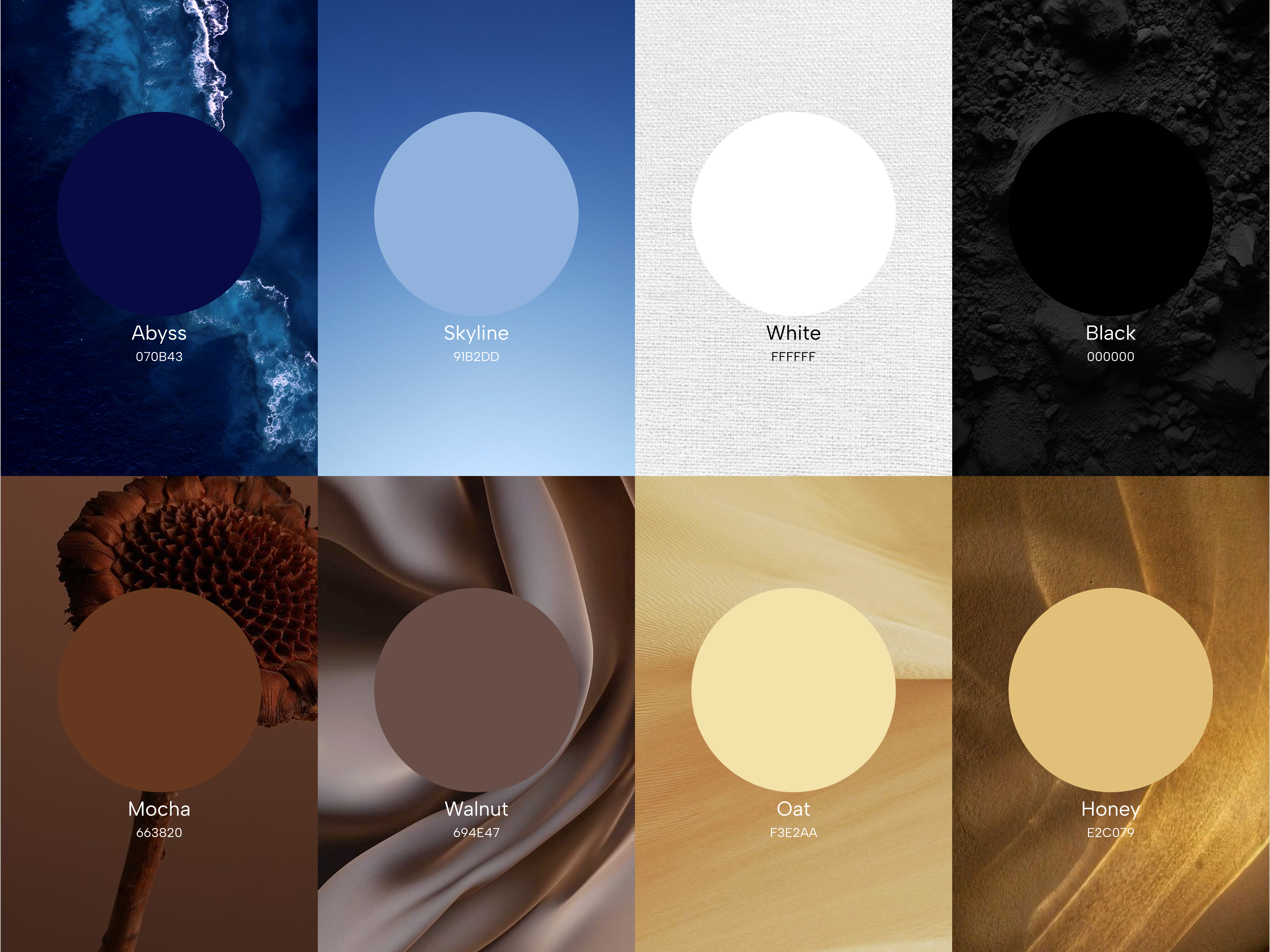
The palette and imagery were deliberately chosen to stand apart from the category default — neither clinical blues nor overly soft pastels. A grounded, natural palette that reads as steady and considered.
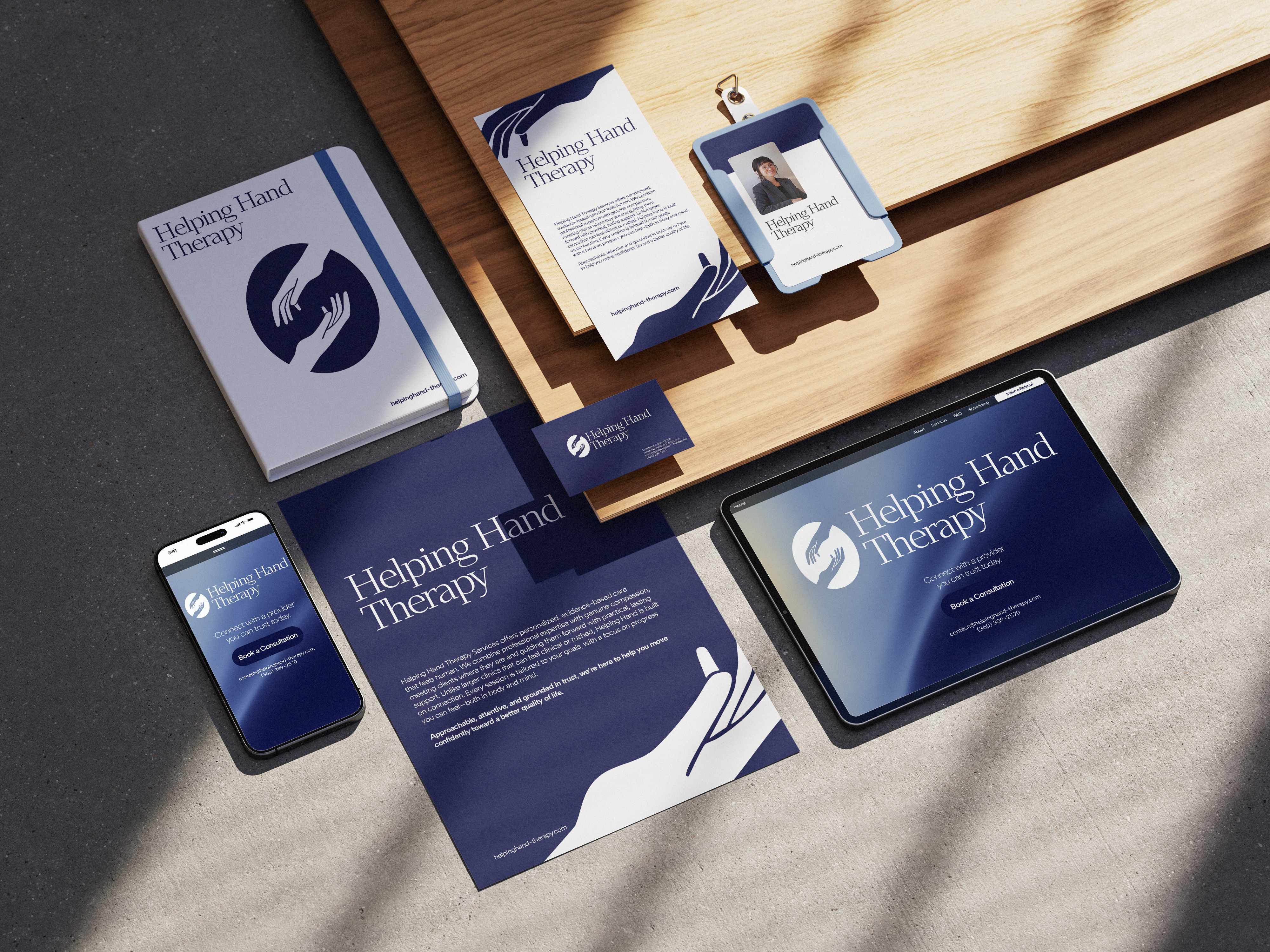
The practice launched with a complete, differentiated system — brand identity, website, and print collateral all speaking one visual language from day one. The restructured information architecture reduced the path from landing to booking, removing friction at every step. The practice now has a presence that feels genuinely distinct in a category defined by sameness.
A brand that earns trust before a single word is read.
.jpg)
